In short. In 2026 you can make your own corporate typeface with an AI tool, without a type studio. With Codex I made three SAB Modul families, 38 styles in total with Cyrillic and Latin, and all the work fitted into a subscription at $200 a month. For comparison: a ready-made family costs from $180 to $1,200 under the basic licence, and a new typeface from a studio starts at £10,000 for one style.
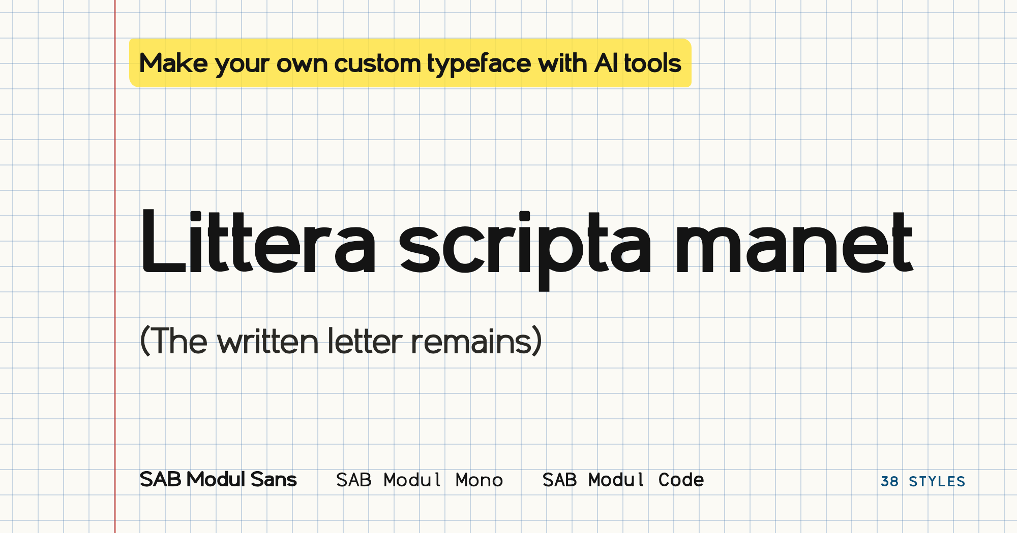
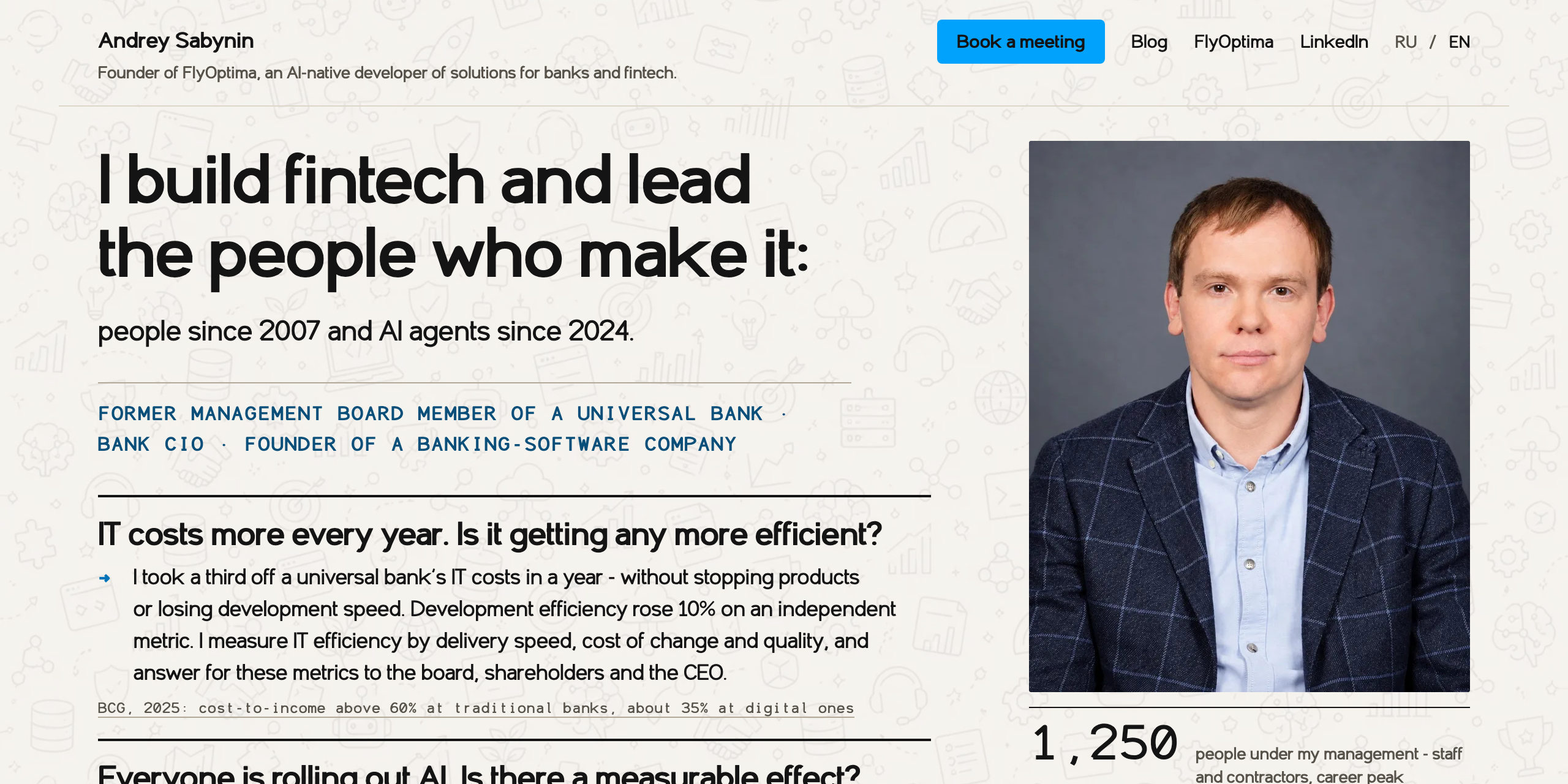
You may not have noticed, but this whole site is set in an original typeface.
I wanted a custom typeface for presentations, code, the website and other materials. For FlyOptima it is part of a style of its own that can be fixed in the brand book. And I myself wanted to create something of my own that nobody else has.
Today it is done like this. You show an AI tool the typefaces you like, explain what you want to change in them, and get your own, a unique one. I showed Codex a reference typeface and asked for three options of an original family: with the same harmonious, professional impression of the text, but with individuality and the twist that matches the spirit of the company.
I now have SAB Modul Sans, Mono and a separate Code family. All the work fitted into my Pro subscription at $200 a month: by my estimate, the project used up less than a quarter of the weekly limit.
Why a company needs its own typeface
I needed a single character of text across the company's materials. A headline on the site, a table in a presentation and a technical document must go together. At the same time the typeface must read calmly, because corporate materials are full of long paragraphs, figures and terms.
A ready-made family solves this task too. I chose my own typeface because I wanted individuality and the freedom to develop the design for my own uses.
What popular corporate typefaces cost
I looked at the prices only after I had made my own family. The table lists five typefaces that are often chosen for corporate identity. The price is for the complete family under the basic licence, checked on 13 October 2026.
| Typeface | What is included | Price |
|---|---|---|
| Gotham | 120 styles | $1,200 |
| Proxima Nova | 80 styles | $975.99 |
| Helvetica Now | 96 styles | $548.99 |
| TT Norms Pro | 104 styles | from 69,195 ₽ |
| Gilroy | 20 styles | $180 |
Sources – the store pages: Gotham, Proxima Nova, Helvetica Now, TT Norms Pro, Gilroy.
This is the price of a ready-made typeface that other companies use as well. The basic licence is limited: a website, an app and a large number of employees are paid for separately. For example, an unlimited TypeType licence costs from 340,000 ₽ per style.
What we did with Codex
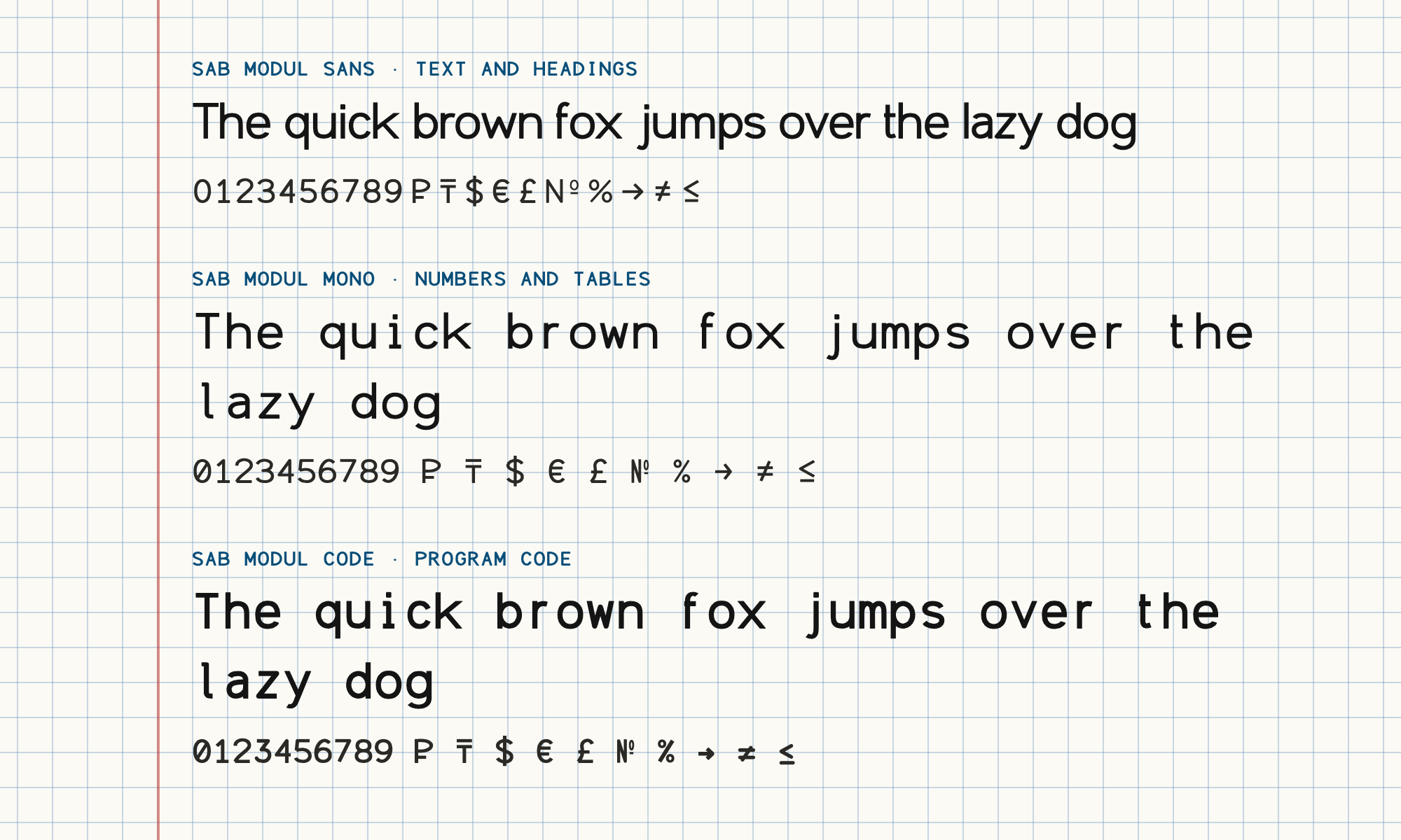
We started with three pairs of a proportional and a monospaced typeface, then developed the chosen direction. In a monospaced typeface every character takes the same width. That is convenient for numbers, tables and program code, where columns must hold.
| Family | Purpose | Styles |
|---|---|---|
| SAB Modul Sans | Body text, headings and interface | 14 |
| SAB Modul Mono | Numbers and technical materials | 14 |
| SAB Modul Code | Program code | 10 |
In total 38 styles are prepared for installation. Each family has Cyrillic and Latin, plus the signs needed in financial documents: rouble, tenge, dollar, euro and pound, the numero sign, per cent, arrows and mathematical signs.
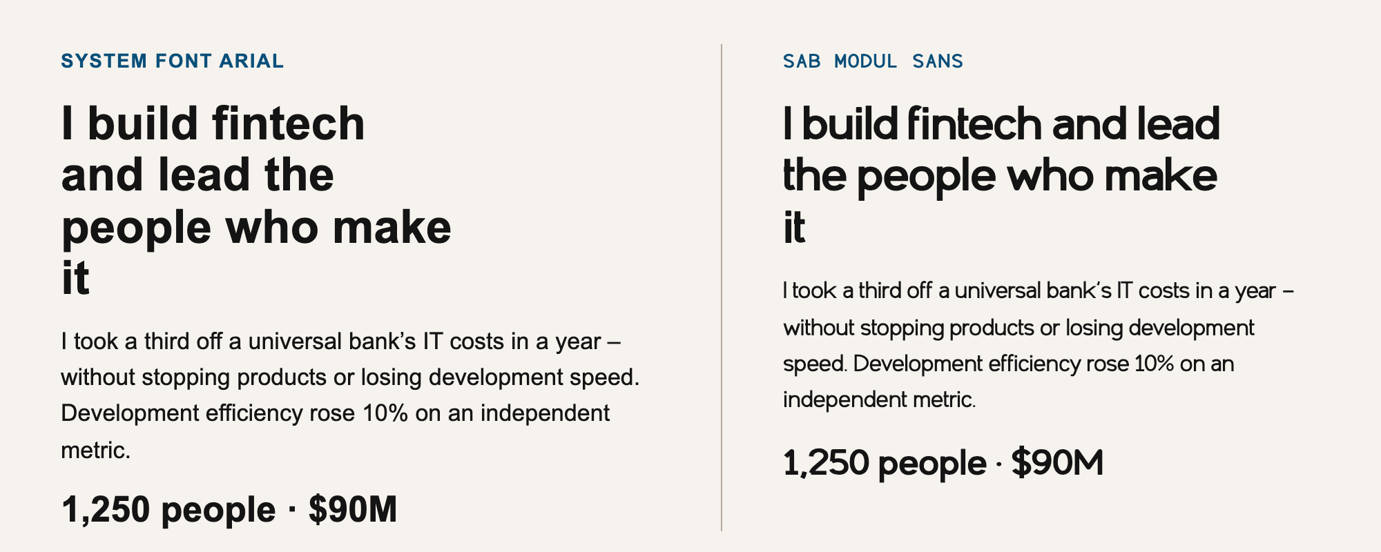
The design of the family is defined by its own sources. The reference helped to compare the impression of the text; we did not copy its outlines. Codex wrote and corrected the program that draws the typeface, built the files and ran the checks. I set the direction and decided whether the text suited my materials.
I am releasing the fonts openly under the SIL OFL 1.1 licence: github.com/andrewsabn/sab-modul. I made them for myself, but now anyone can use them. The licence allows commercial use and modification. The font itself may not be sold on its own, and a modified version must be given a different name: the name SAB Modul stays with me.
Why the first letters were not yet a finished typeface
When I compared whole paragraphs, I saw that some letters "danced" relative to their neighbours. A headline looked acceptable, but body text did not read the way I wanted. I was disappointed and wrote to Codex: "Listen, why does a typeface take so long? It is harder than making a website."
The main problem turned out to be the relations between letters, that is, the harmony of words. Type designers have their own terms for this. Every letter has margins on the left and on the right, called side bearings. Together they make up the letter spacing – the distance between adjacent letters. Kerning is a separate correction for pairs that at normal margins stand too far apart or too close, such as "AV". Round letters are made slightly taller than straight ones, otherwise they look smaller: this is optical compensation. When everything is tuned, a paragraph looks like an even grey field without dark spots and holes. This is called the colour of the text.
If you correct one letter at a large size, it is easy to improve it and make the word worse. So after every substantial correction we returned to the same page of text. I put the goal this way: "we need the same level of harmony in the text". That proved more useful than demanding similarity of individual characters. We compared identical paragraphs, different weights and slant, Russian and English text, numbers and punctuation.
There were steps back too. Thickening the auxiliary characters made the counters inside letters worse on a small screen, and we rolled those corrections back.
How we checked the result
A typeface must work the same way on a website, in a document, in a PDF and in any browser. There are rules for that. For a website the font is supplied in WOFF2 format, for installation on a computer – in TTF and OTF. In a PDF the font is embedded in the file itself, and that must be checked. A browser checks the structure of the file before loading it and will not show a damaged font.
All of this can be checked with open tools.
| Tool | What it checks |
|---|---|
| FontBakery | Automatic quality checks: names, metrics, character set |
| OpenType Sanitizer | File structure; the same filter is built into Chrome and Firefox |
| FontTools | The font build and its internal tables |
| FontGoggles | How text looks in different weights and languages |
| Wakamai Fondue and FontDrop | What is in the file: characters, languages, features |
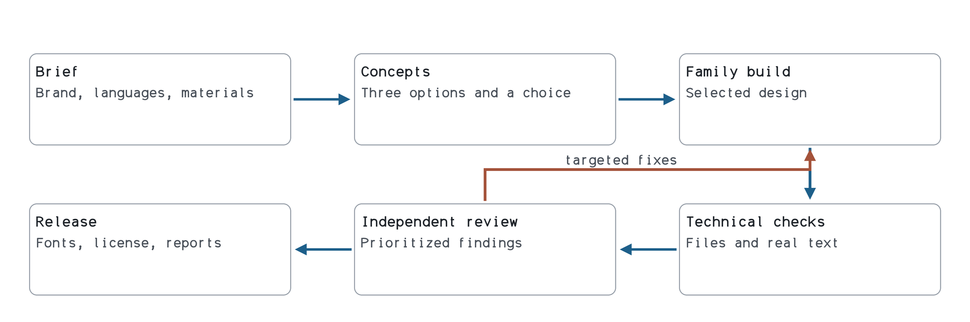
A technical check alone is not enough: a file may open without errors while the paragraph still looks bad. So we read the typeface in real materials and gave it to two other agents for an independent review. OpenType Sanitizer accepted all 154 files of the release package. The set is accepted with a few exceptions; they are recorded next to the reports in the repository.
A prompt for creating your own typeface
Start by choosing a direction on a small sample, and develop the full family later. I wrote down our way of working as a prompt for an AI tool. The main steps are these.
- Pick a few typefaces you like, paid ones included, and work out what you want to change in them.
- Ask for three small concepts on the same words and paragraphs and choose one. Other people's outlines must not be copied.
- Bring the regular style to harmony in words and paragraphs, then develop the weights and italics.
- Compare versions on one proof sheet with real text, numbers and code. If it got worse, roll the correction back.
- Before release run the technical checks and hand the typeface over for an independent review.
The full text of the prompt with the table of checks can be copied: a prompt for creating a typeface.
When it makes sense to do it yourself and when to go to a studio
I believe that in 2026, if you know how to work with AI tools, in 90 per cent of cases you do not need to go to a studio for a new typeface and pay a lot of money for it. Better pay for a subscription.
For comparison: the studio Jamie Clarke Type quotes £10,000–16,000 for a new typeface with one style for Western European languages, with the licence paid separately (the studio's terms). Cyrillic and additional styles increase that sum.
A studio is worth going to in the remaining cases: when you need a complex script, an experienced art director or contractual responsibility for a large corporate release. And in any case it is the owner who will have to decide what "I like it and it fits the company" means.
What I understood and what remains to be checked
When I saw the finished set, I was pleasantly surprised by the quality of the result. Seeing my typeface for the first time, I understood that it has features of its own and the twist I wanted. That, in fact, is what I started all this for.
The set is accepted for Russian and English text; new languages will need a new check. I use it in my materials and develop it from the saved sources.
I believe the world has changed for good. A machine will be able to do almost any intellectual work, given due persistence from a human. A subscription at $200–500 a month already gives you the tools to create your own typeface yourself.